Legal & General
Paving the Way for Growth: Redesigning L&G’s Adviser Journey

The brief
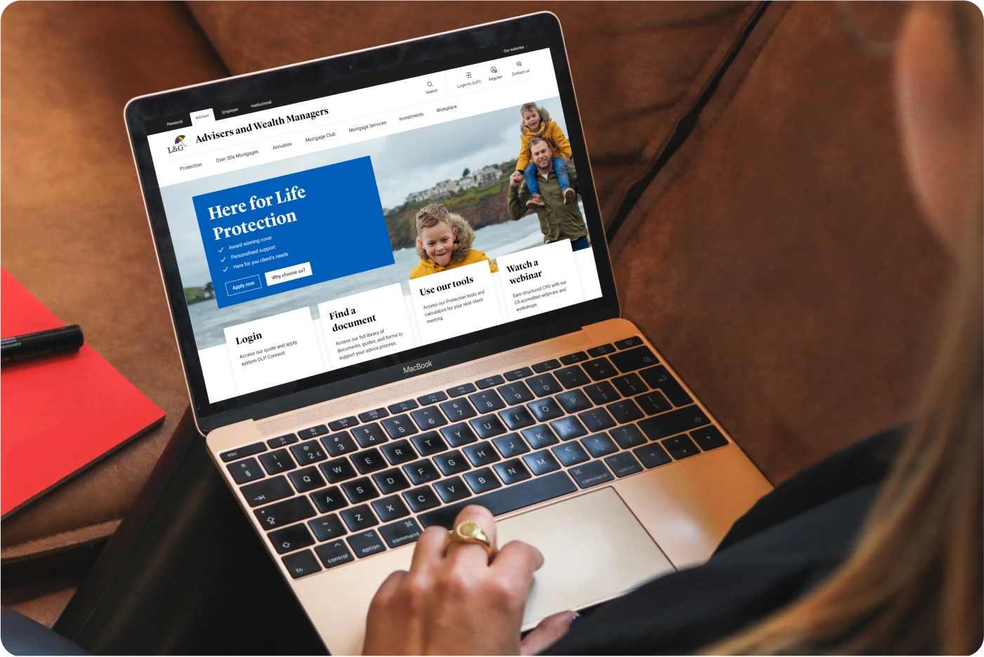
Legal & General (L&G) is one of the UK's largest insurance and investment management companies, serving millions of customers through their network of financial advisers. Ahead of a major 2025 campaign, the B2B Marketing team needed to be confident that the adviser-facing Protection section of their site could handle higher traffic, drive higher conversion and deliver real value.
But the existing Protection pages were letting advisers down. Key resources were buried three or more clicks deep, internal jargon clouded understanding, and many journeys ended abruptly with no clear next step. Advisers were contacting L&G support agents instead of going to the website, because they found the navigation too confusing. This not only represented a poor experience, but created a larger operational burden for L&G.
Drawing on our insurance sector expertise, we knew these weren't just usability issues, they were barriers to L&G's competitive positioning and growth.


Project summary
In just six weeks, we ran a rapid discovery, restructured the information architecture for Protection products, services, and resources, and redesigned 16 key pages. The work acted as a strategic proof of concept, showing how the adviser site could be transformed more widely. We recommended a broader site redesign, aligning navigation with what advisers expect from competitor sites - so they can find critical resources faster and L&G can strengthen its competitive position.
Project in numbers
£113bn
expected value of the UK’s protection market by 2029
6 Weeks
for discovery, redesign, and strategic recommendations
16 Pages
optimised for adviser needs
“Overall, end-to-end, the experience was faultless. They delivered great work, in a great way, and were a pleasure to collaborate with.”
Justin Hay, Marketing Business Partner, Retail Protection
Understanding adviser needs
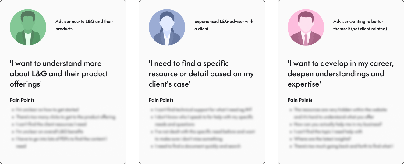
We started by bringing everyone together. In week one, we ran an in-person workshop in Cardiff to align on user needs and business goals. Together with the L&G team, we mapped what advisers were trying to achieve on the site and where they were struggling. This led us to define three core user personas, giving us a clear decision-making filter for design choices that followed:
• A new adviser who wants to learn about L&G and their products
• An experienced adviser who needs to find a specific resource or piece of information relevant to their client’s case
• An adviser who wants to deepen their expertise, without a specific client in mind
To validate these personas, we interviewed stakeholders across Propositions and Sales who regularly engage with advisers. While each persona had unique pain points, several issues were common to all:
• Complex navigation
• Critical resources hidden several clicks deep
• Fragmented support content
• Journeys that too often ended in dead ends


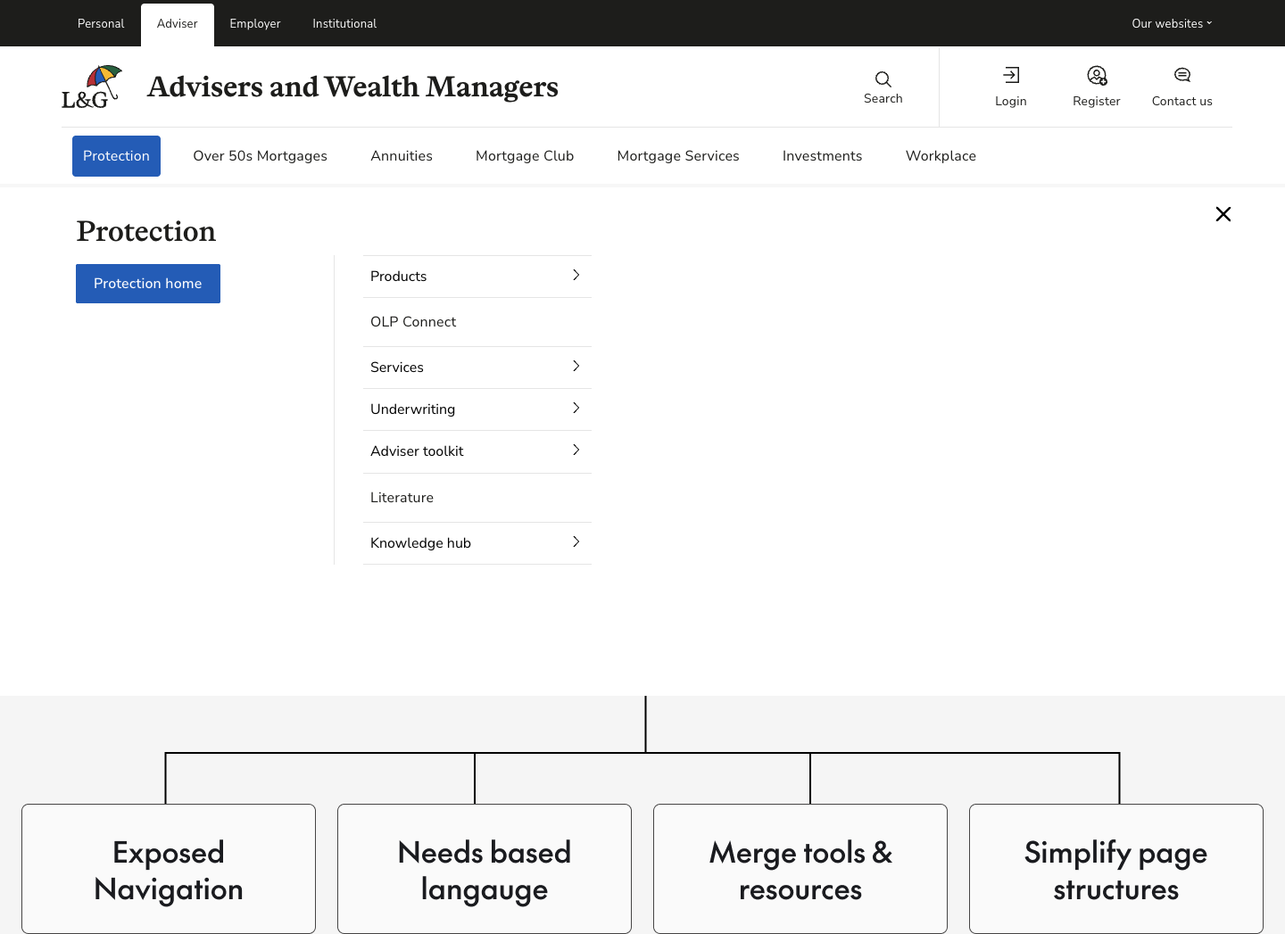
Turning competitor insights into strategy
With this foundation, we turned outward to understand the competitive landscape. We analysed adviser sites from Aviva, Royal London, LV, and Vitality, identifying patterns we could learn from:
• Exposed navigation that cut down clicks
• Centralised resource hubs
• Plain-English labelling
• Needs-based language that maps to real adviser intent
These insights directly shaped a new information architecture built around adviser goals, not L&G’s internal product structures.
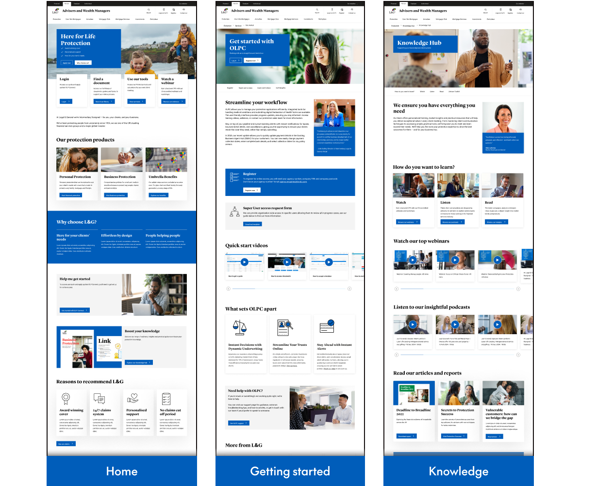
Rapid design iteration
From there, we moved quickly into design. Working within L&G’s existing CMS components, we wireframed 16 key pages to create clear user pathways and a consistent content hierarchy. Weekly demos with the L&G team allowed for rapid iteration and alignment.
Once the structure was in place, we translated wireframes into high-fidelity designs. We broke up dense copy with purposeful variation, spotlighted expert voices to establish credibility, and added onward links to eliminate dead ends. Deep-dive review sessions with stakeholders ensured every decision supported adviser needs while staying true to the brand.
We also recommended qualitative and quantitative metrics the team could use to measure the success of the work, and prove the value of the adviser-led approach.
Extending the proof of concept
Alongside the page redesigns, we developed broader recommendations for an adviser-centric navigation system. These proposals outlined how L&G could move from an internally-oriented structure to a retail-led approach that matches competitor expectations, making value more visible across the site.
Conclusion
The 16-page redesign acted as a strategic proof of concept, showing how a user-centred approach can be applied across L&G’s adviser site. By simplifying navigation, consolidating key resources, and aligning the site with adviser expectations, we improved usability and engagement - helping to increase conversion, boost retention and loyalty, reduce operational costs, and drive higher sales volumes.
We’re looking forward to working with L&G again soon to extend these improvements across the wider site.
“The before-and-after comparisons are outstanding, and the early feedback we’ve received internally has been overwhelmingly positive. We’re really excited to see how this continues to land and what comes next.”
Justin Hay, Marketing Business Partner, Retail Protection


